Component Properties in Figma

Components are the elements that can be reused by designer to maintain the consistency and efficiency in design. The components can be used from project to project.
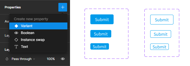
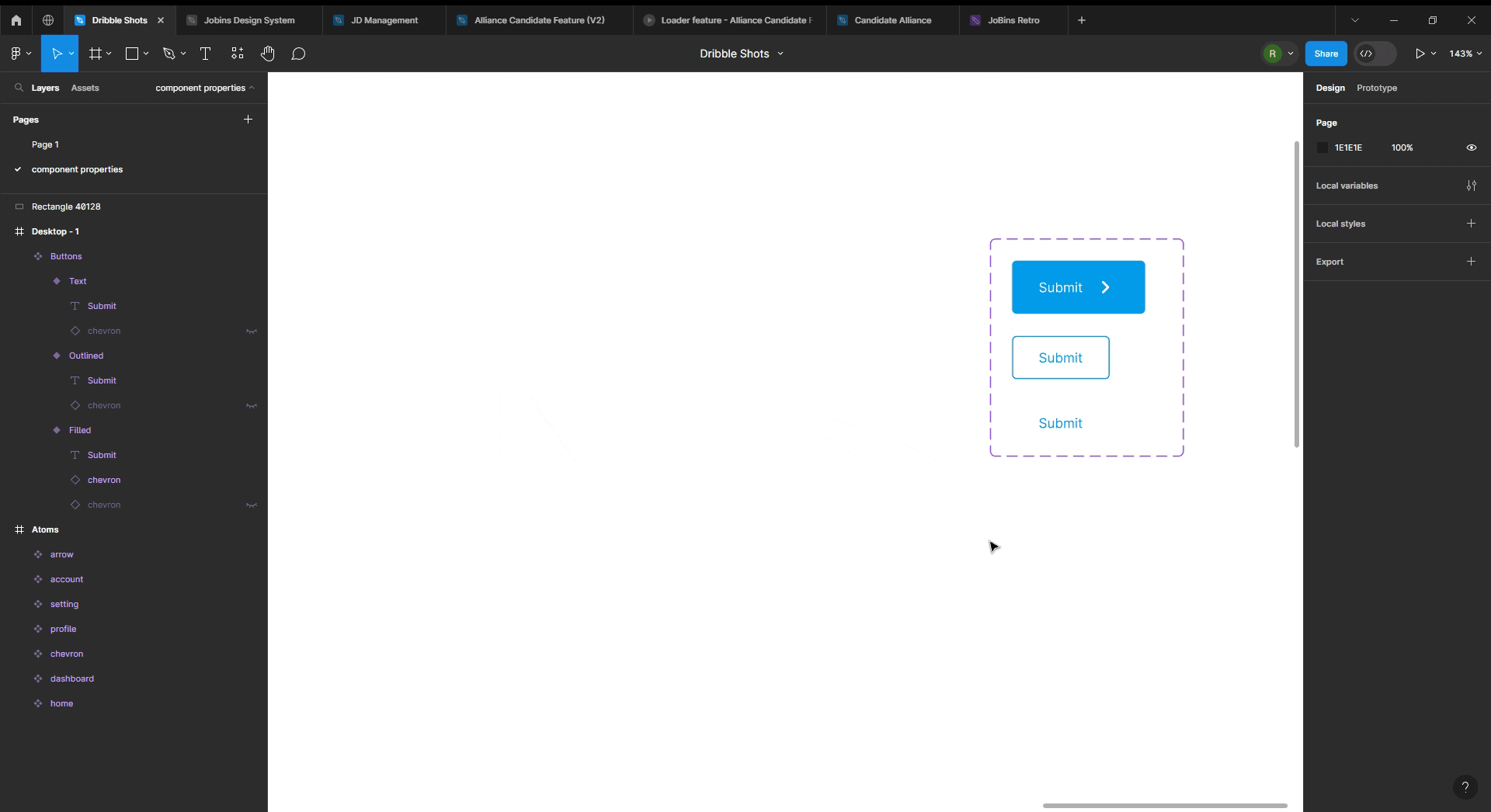
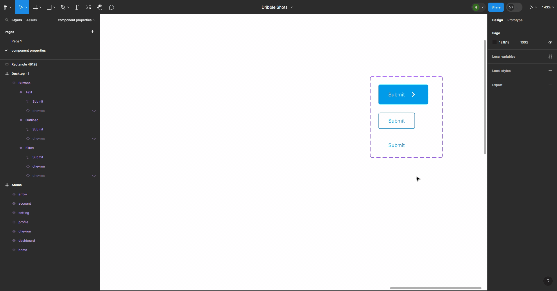
Component properties are the changeable aspect of component. The component properties ease designer to change the click, edit and drag the color, size, button icons, text without visiting the nested frames of the elements. They can be of two levels: Parent layer or Child Layer (built from main component). Taking about the component properties, there are 4 on the list:
Variant property
Text property
Boolean Property
Instance swap property

Variant property
Variants are the children elements that can be only generated from parent layer or parent elements. A variant property enables us to specify attributes for our variants, such as state, color, or size.
Steps to follow:
Create an element (say button) and make it component
On selecting the component, click on the properties "+" on the right side bar
Choose the Variant option
Now the variant component is created and name of the variants can be given
Once variant property is created, we can easily choose the required variant of an element without double clicking and editing the elements from the right side bar.

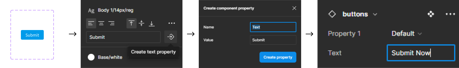
Text property
As the name states, this property is used to update or edit the text of the container or component. Instead of double clicking to an individual text layer and changing it's text content, this property helps to optimize the way of changing the text on text layer(of components, elements) from the right side bar. This helps us to prevent from going to the nested frames or double clicking containers to change it's text. And as a result, it increase the efficiency of work and can be helpful to use on the design team as well.
Steps to follow:
Create a component and select the specific text that will serve as the basis for creating the text component
On the right sidebar click the arrow like icon that reads "create text property" while hovering
Name the component and add value on it
Click "create property". The text component property is created
Now, the desired text value can be easily changed from the right sidebar without diving deep inside the component layers.
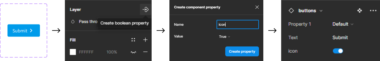
Boolean Property
Boolean means set of two value where result can only have one of two possible values at a time. It can be True/False, Yes/No, 0/1 and son on.
Figma allows us to set a True or False value for a specific layer in your component. It is majorly used to make the visibility of icon, text on or off according to the requirement.
Steps to follow:
Create a component along with the assets (say icon)
Select text layer or the asset according to which you want to apply Boolean property.
On selecting the layer, click on the arrow like icon on right side of figma which reads "create Boolean property" while hovering.
Now, name the property and set the Boolean value (True/False)
Click create property button and the Boolean property is ready to use
Now, while using it's instances, we can see the toggle feature on right sidebar from which we can set its' value. Toggle on to hide property and Toggle off to make property visible.
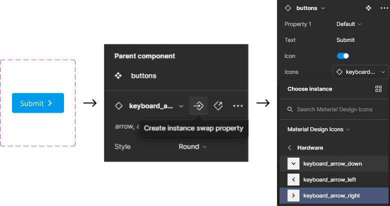
Instance swap property
Instance swap property allows us to easily swap the items to whom the property is applied without selecting the nested frames. This property is more focused to swapping icons form components. It is necessary to remember that the items can be swapped only from the list of component set of your local or shared library.
Steps to follow:
Create a component along with the assets (say icon)
Selecting the asset, click on the arrow like icon on right sidebar that reads "create instance swap property" while hovering
Choose the asset from the collection of icons component
Then, Instance swap property is created
Note: For using icons/assets in instance swap property it should be in form of component
Now, while using the instance of this component we can apply instance swap to change the icons according to need without selecting the inner layer.
Conclusion
In conclusion, mastering the Figma component properties (text, Boolean, instance swap, and variant) and using these properties in work enhance makes design for creating visually appealing, consistent, and interactive designs. These features contribute to a more efficient design process, allowing designers to build complex interfaces with ease.
It's important for designers to stay informed about new features and improvements as Figma develops further. Adopting these characteristics enables designers to build flexible and also a scalable design systems.