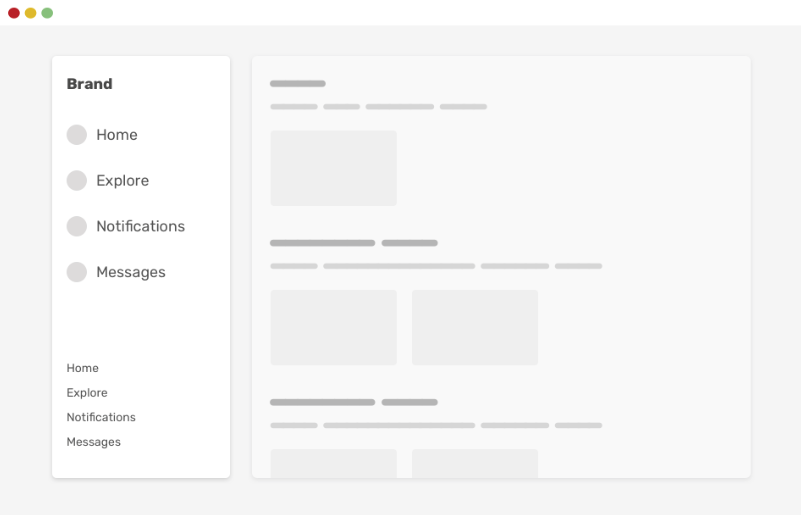
Embracing a CSS Defense Strategy
Exploring the new tools and techniques on frontend development. Loves to meet up with new people and participate in the community. I do interesting stuff on codepen https://codepen.io/nirazanbasnet
Hey there, CSS enthusiasts! But before we get all serious with the blog, let's take a moment for a CSS meme break. 🎉

In today's blog, we're going to chat about something we've all encountered in our coding adventures: defending ourselves against those tricky CSS issues and gearing up for the future. Also, we explore ways to tackle CSS challenges with tips and tricks 🍕💻
CSS Logical Properties
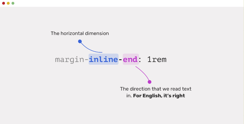
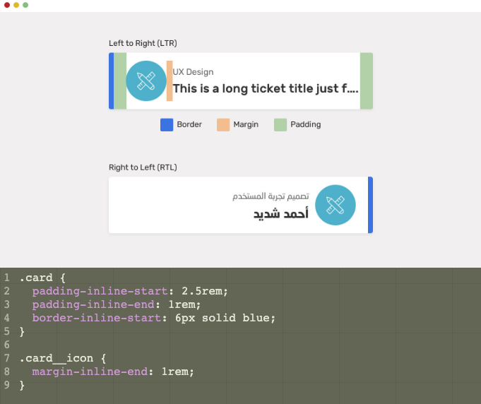
Provide the ability to control layout through logical, rather than physical, direction, and dimension mappings.
Normal Approach
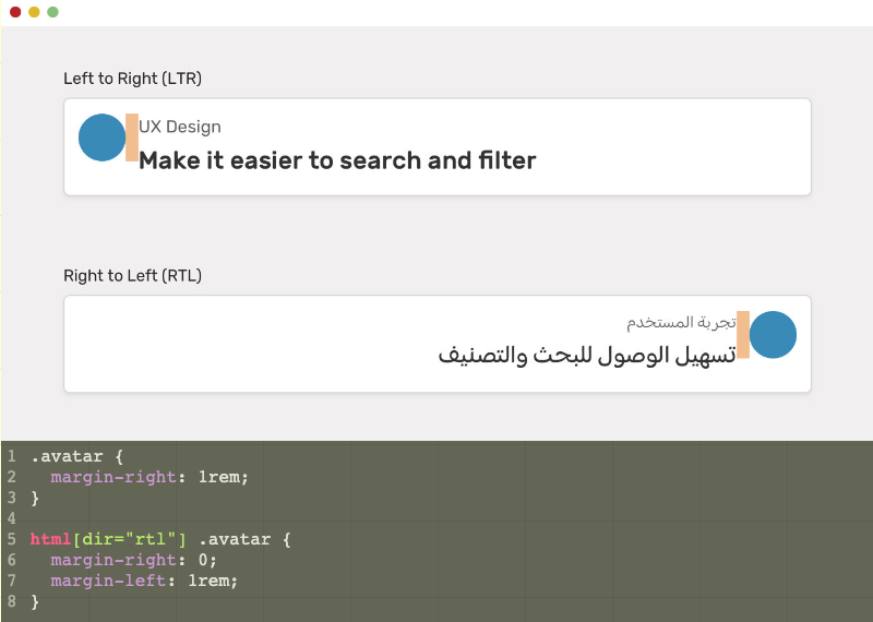
With Logical Approach - How it works
CSS Parent Selector (:has)
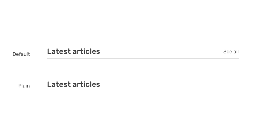
<section>
    <div class="section-header">
        <h2>Latest articles</h2>
        <a href="/articles">See all</a>
    </div>
</section>
.section-header {
    display: flex;
    justify-content: space-between;
}

.section-header:has(> a) {
    align-items: center;
    border-bottom: 1px solid;
    padding-bottom: 1rem;
}
CSS pseudo-class - :is() and :where()

ol {
  list-style-type: upper-alpha;
  color: darkblue;
}

/* stylelint-disable-next-line selector-pseudo-class-no-unknown */
:is(ol, ul, menu:unsupported) :is(ol, ul) {
  color: green;
}

:is(ol, ul) :is(ol, ul) ol {
  list-style-type: lower-greek;
  color: chocolate;
}
Comparison between :is() & :where()
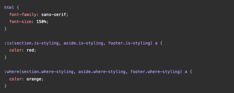

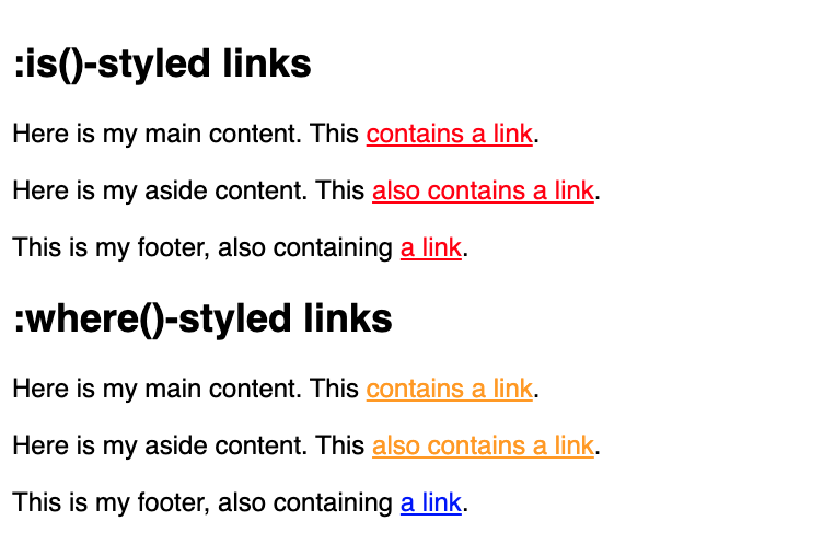
The difference between :where() and :is() is that :where() always has 0 specificity
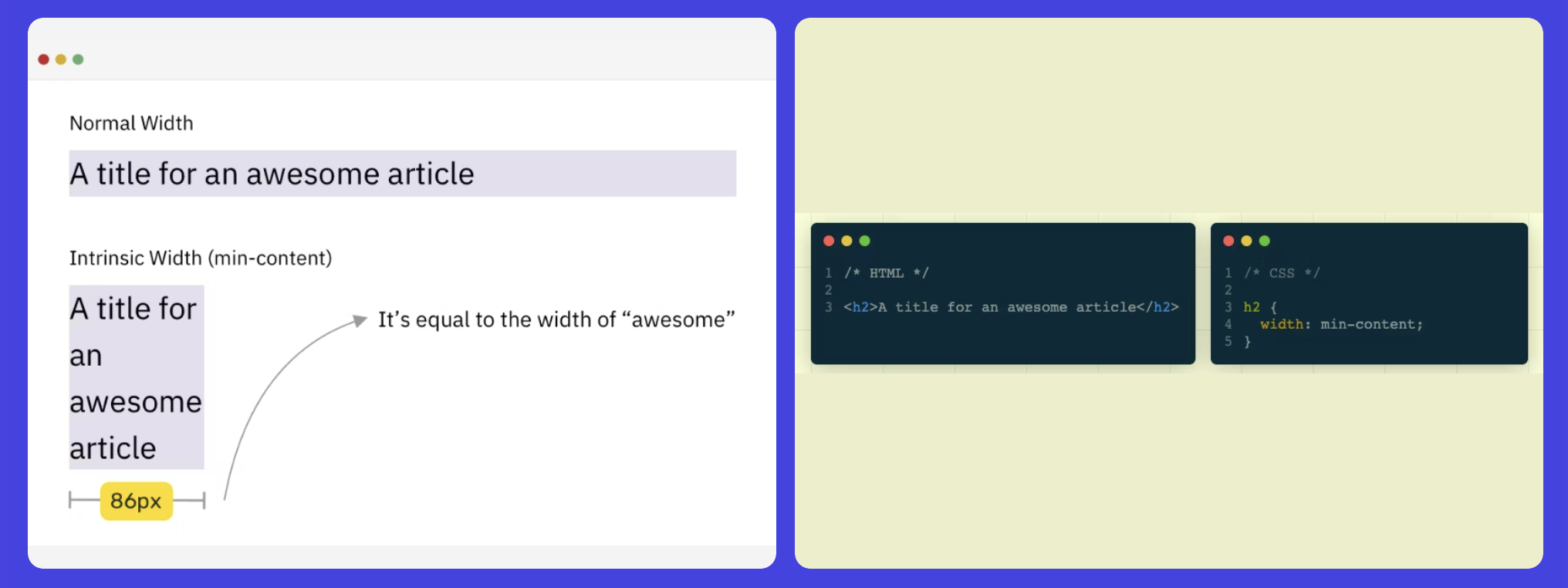
Intrinsic Sizing
One way of sizing an element depends on its content size and using fixed values for the width or height of an element.
Min Content
Max Content

Fit Content
<h2>A heading, block-element, with a fit content property</h2>
h2 {
    width: fit-content;
}
Adopting a Defensive Mindset
Avoid a certain CSS issue or behavior from happening.

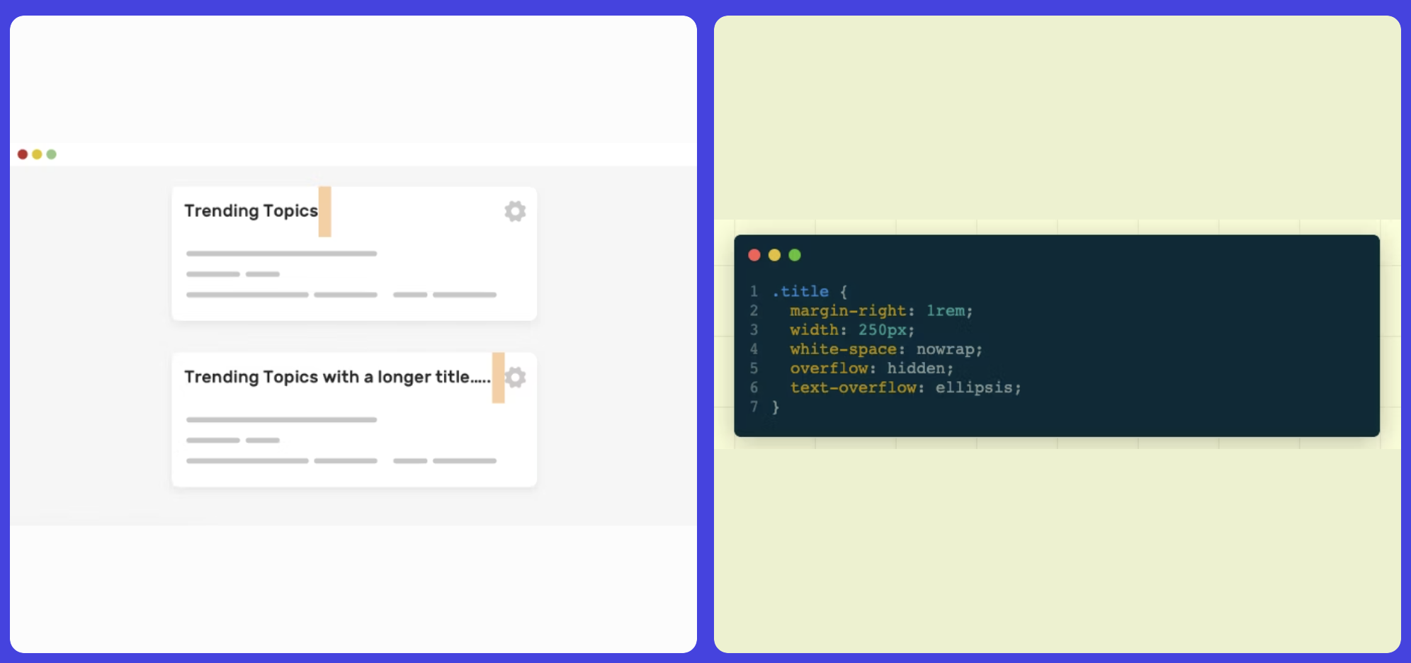
SPACING
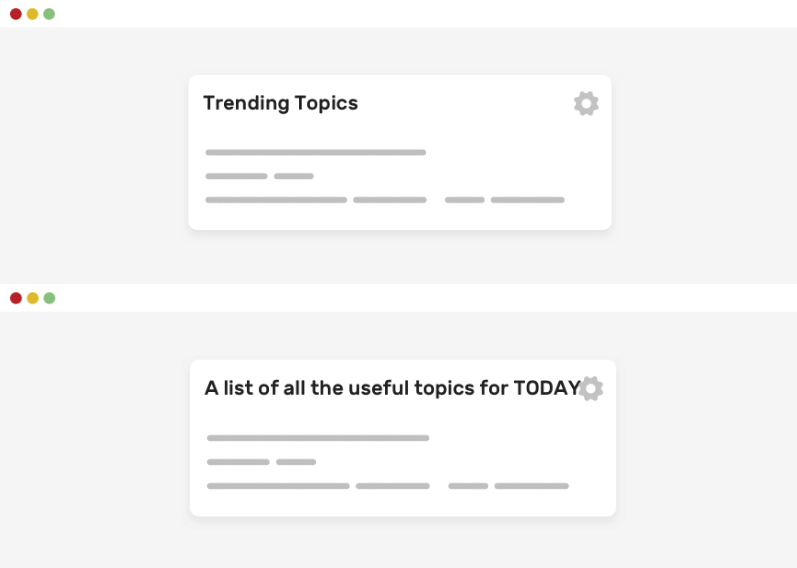
To solve such problems use text-overflow: ellipsis property
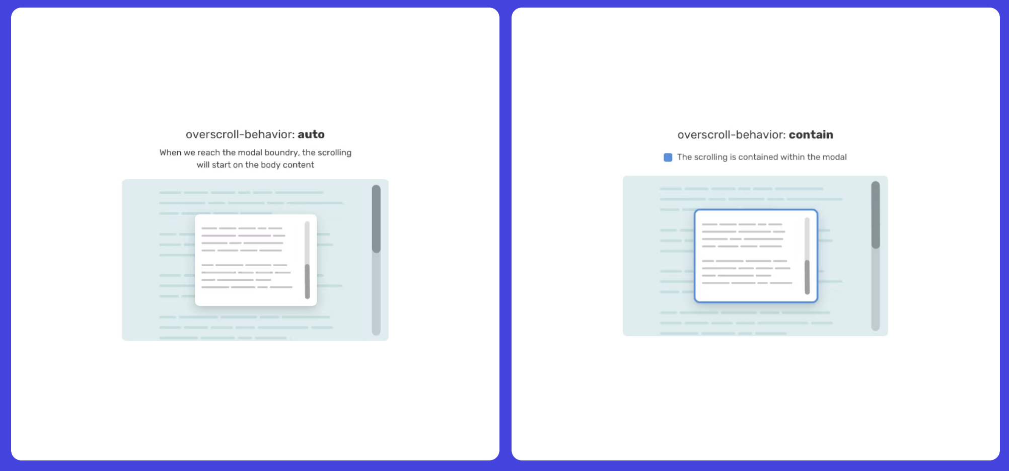
Lock Scrolling Chaining
Ever experienced that moment when you open a modal, start scrolling, and suddenly find yourself scrolling the content underneath the modal (aka the body element) once you reach the end? That, my friend, is what we call scroll chaining.
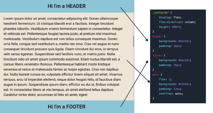
Using flex, flex-col & overflow for dynamic height
Vertical Media Queries
We can solve the issue by Use position: sticky property.

Parent relative position: fixed

A better approach using max-width: inherit
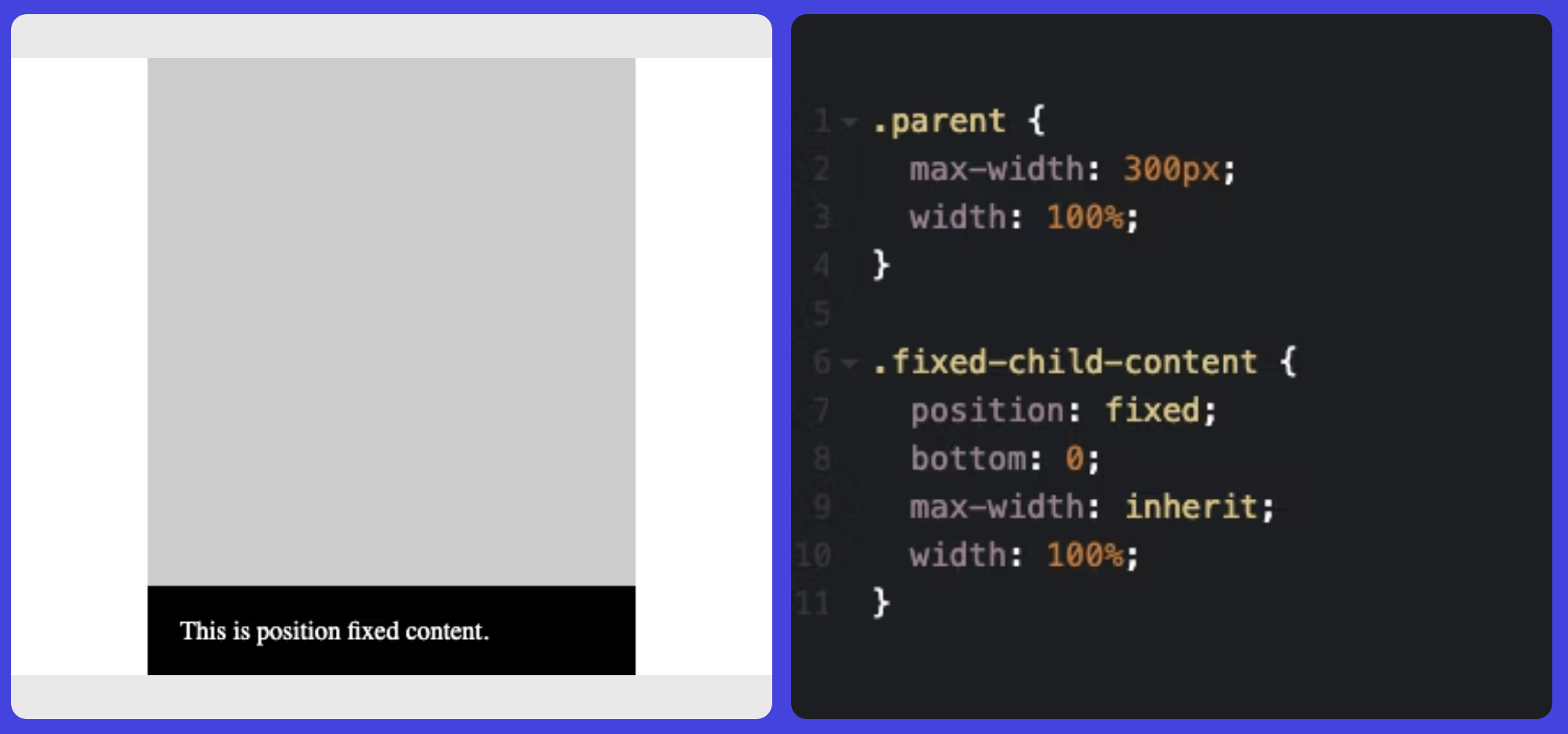
Note - Just do not use
leftandrightproperty
Some of the Conditional CSS
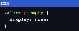
Using :empty selector
Using @media (hover: hover)

the hover style will only work when the user is using a tool device like a mouse or a trackpad.
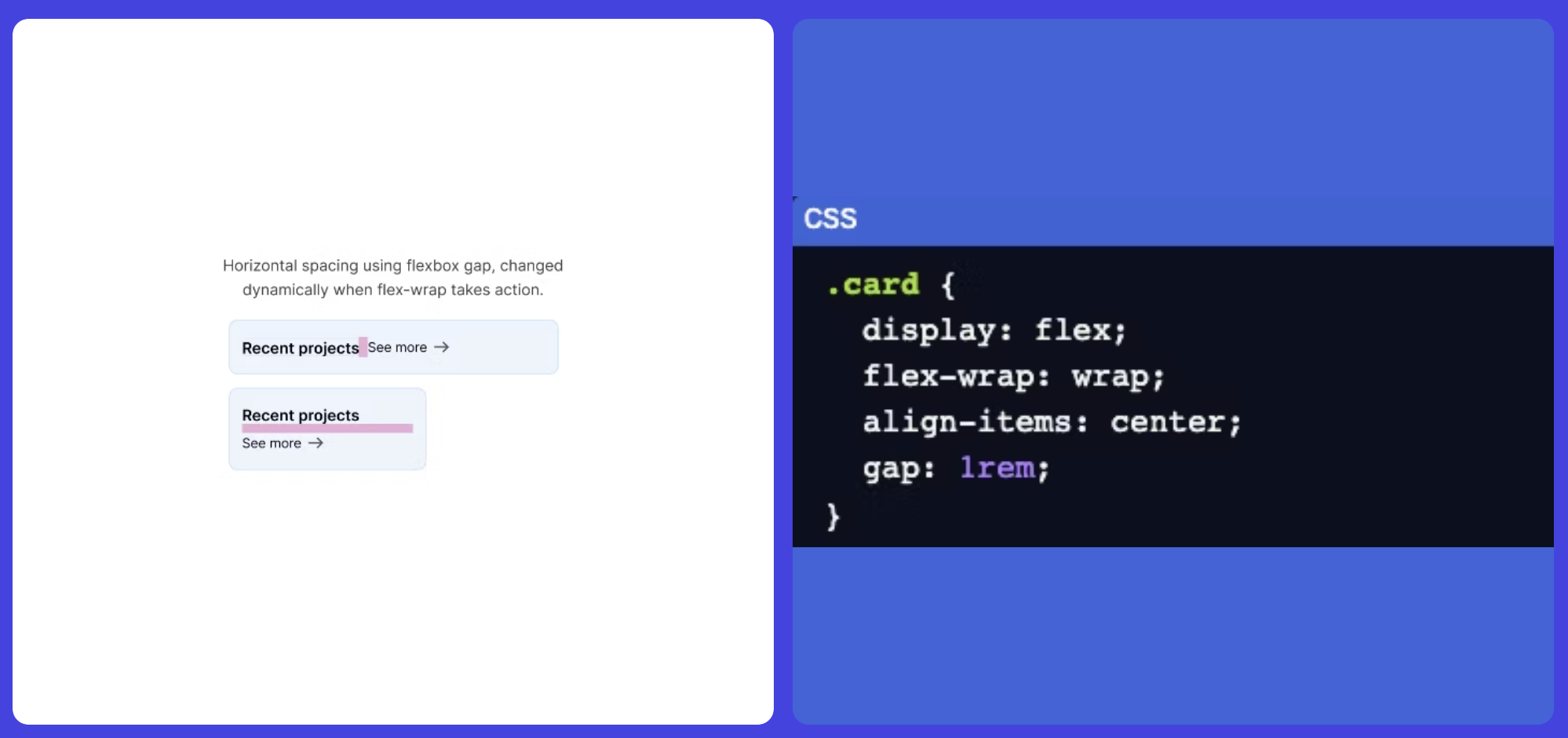
Flexbox Wrapping
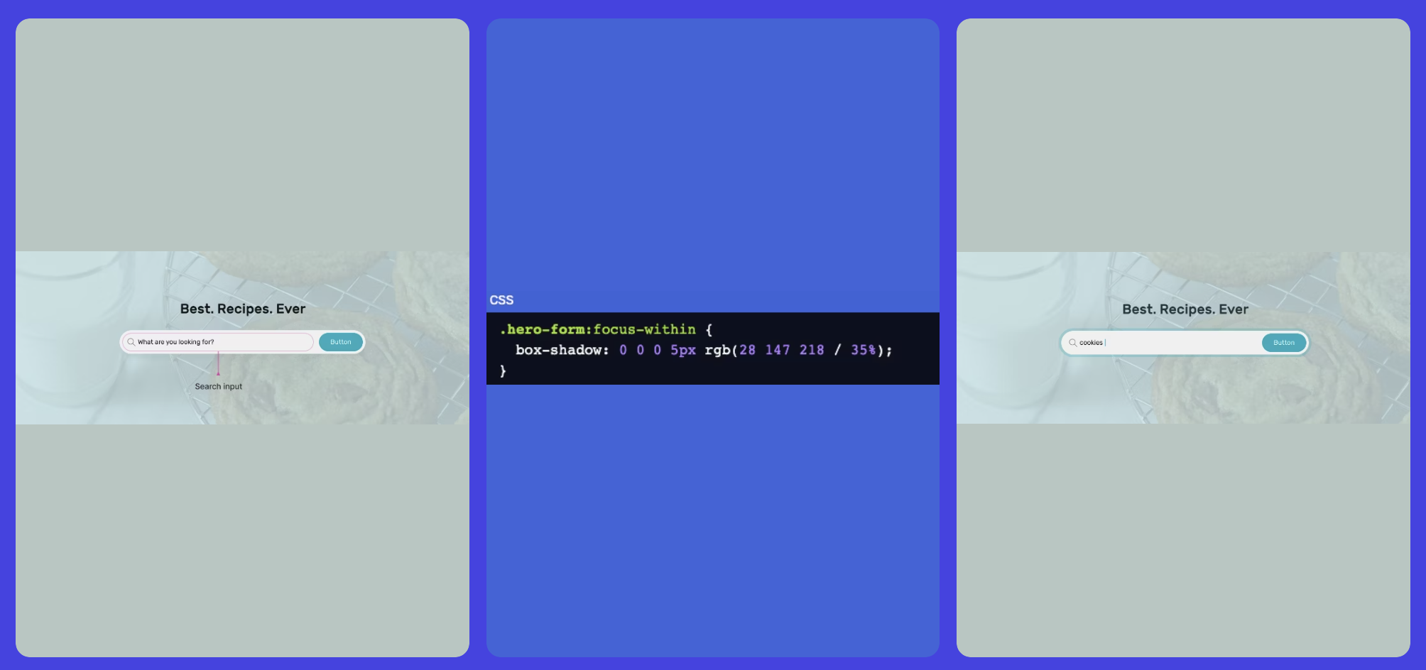
The :focus-within Pseudo-Class
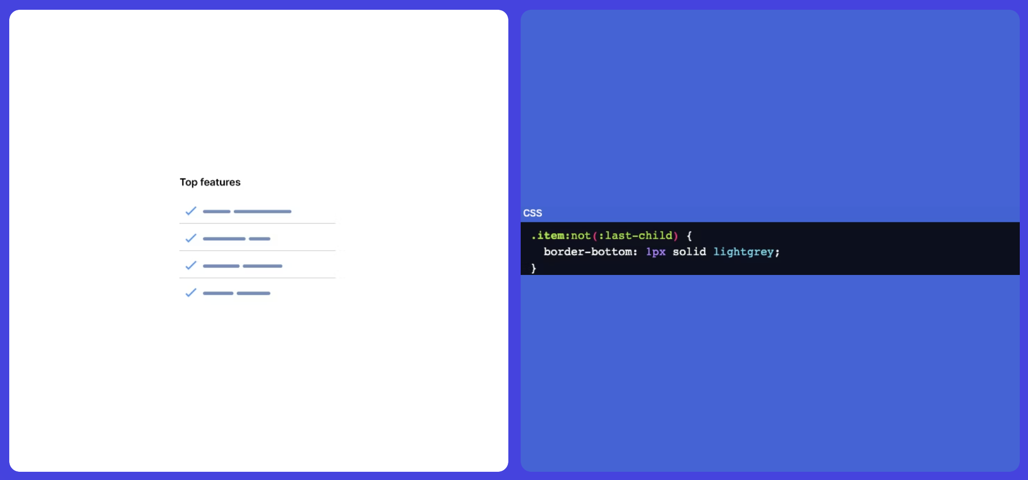
The :not Selector
This pseudo-class functions by excluding elements that don't match a specific selector. For instance, it proves handy when you want to verify if an item is the last one and, if so, remove the border.
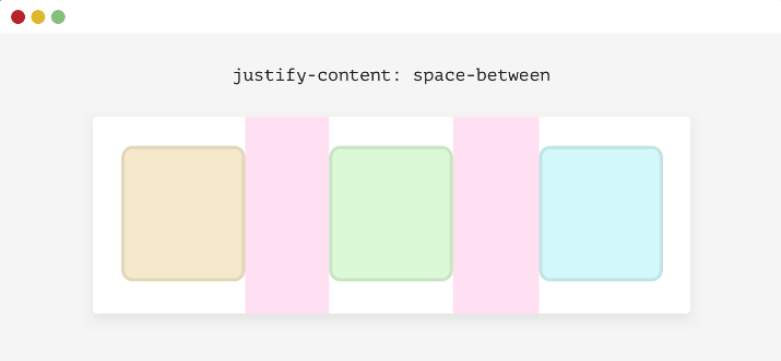
Using Justify-Content: Space-Between

When the number of items is less than four, here is what will happen.
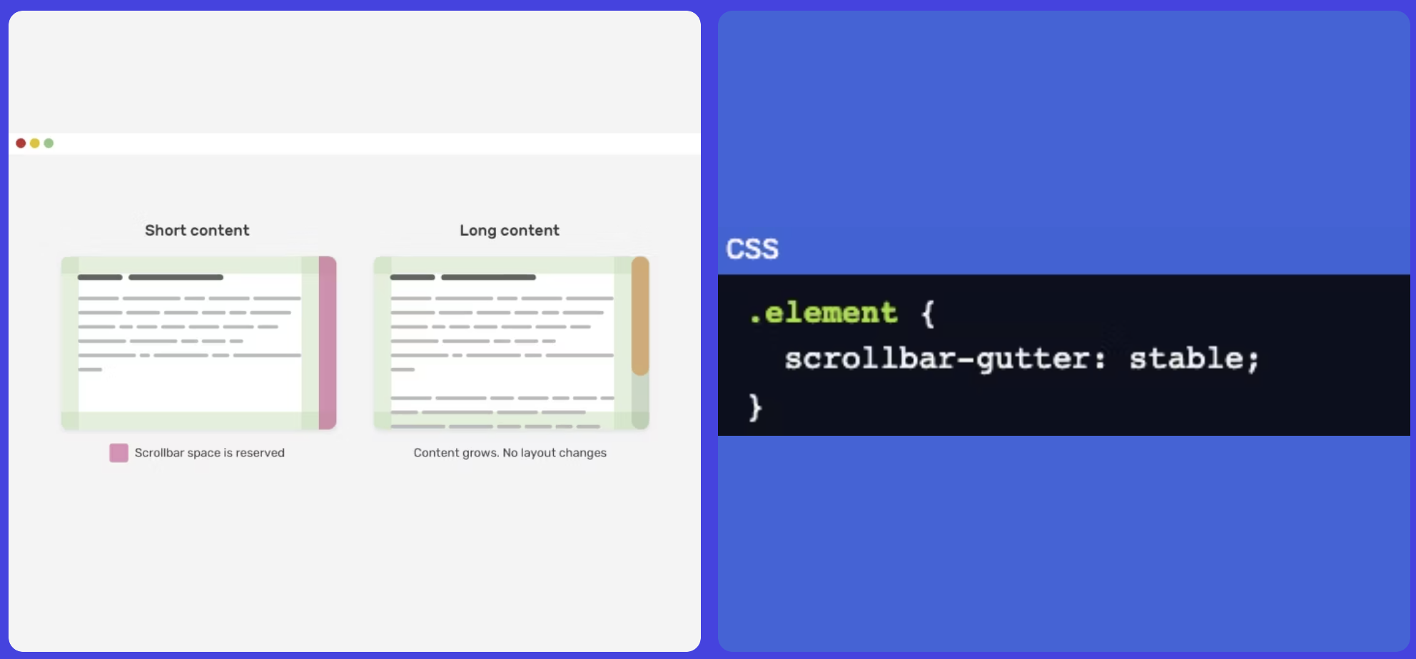
Scrollbar Gutter
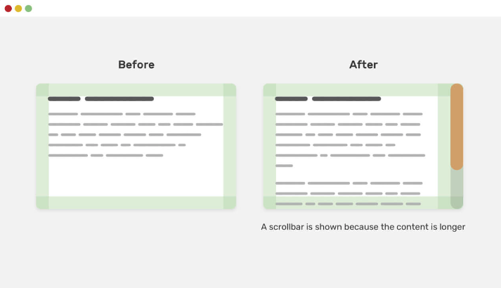
After using the scrollbar-gutter property.
CSS Markers

Summary
In a nutshell, coding like a pro in CSS is all about staying in the loop! Keep tabs on the latest features and specs, dive into articles on best practices, and make friends with MDN web docs for handy references. Don't shy away from peeking into others' code on platforms like Codepen and Awwwards for some cool insights.
Oh, and don't forget to embrace your inner explorer so, hop on the CSS adventure and let your coding journey shine! 🚀
Keep on Hacking, Cheers.