Fixing Flex Scroll Height Overflow with Margin Auto
Exploring the new tools and techniques on frontend development. Loves to meet up with new people and participate in the community. I do interesting stuff on codepen https://codepen.io/nirazanbasnet
Hello CSS enthusiasts!
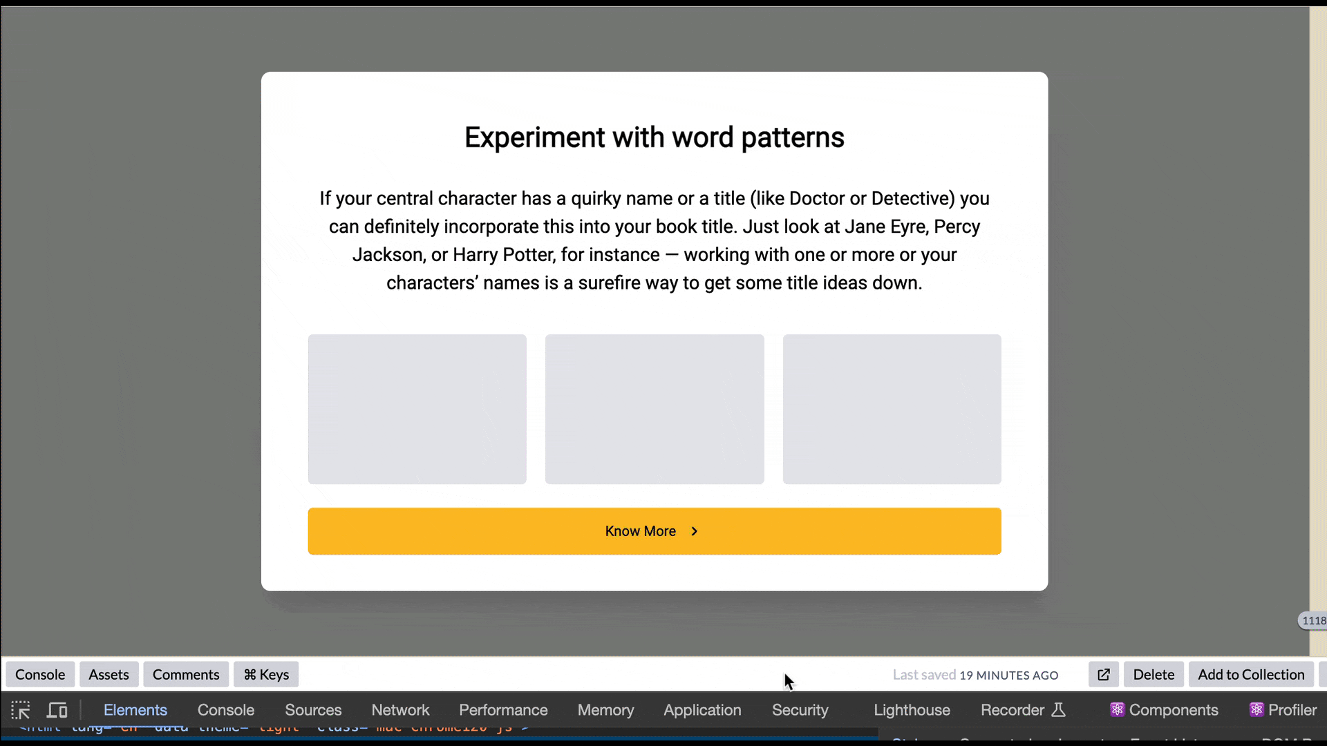
Guess what happened to me today? While working on the modal, I needed the content to be perfectly centered vertically and need to have a scrolling effect where I set a specific height (e.g., 80vh). However, things got a bit tricky on small devices. Despite adding a scrolling effect that centered the content, the top section was overlapping, making it impossible to scroll to the top.
In an attempt to solve this frustration, I experimented with various CSS properties such as flex, flex-direction: column, align-items:center, justify-center:center, overflow-auto, and setting the height to 100%. Unfortunately, these attempts did not yield the desired result. It became apparent that this approach posed a challenge when the flex item exceeded the size of the flex container.
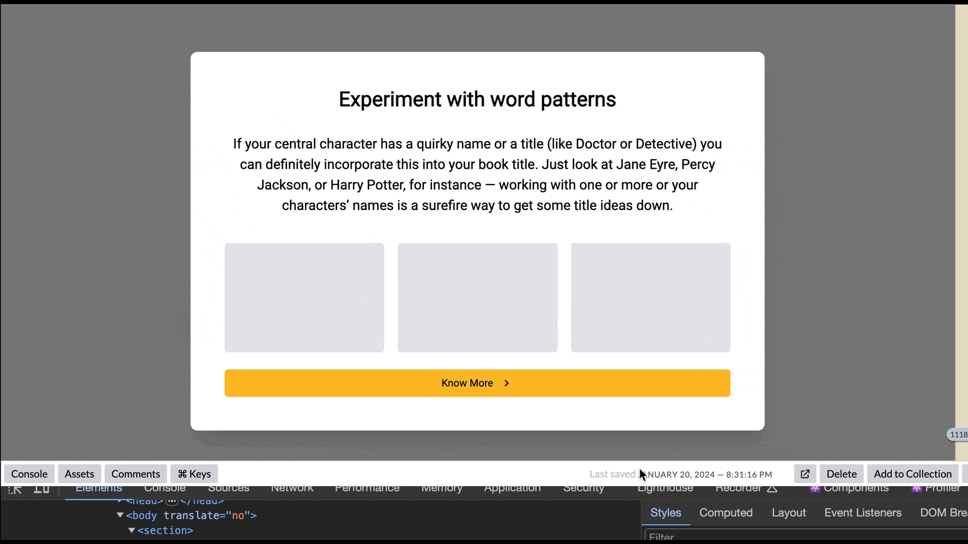
You can check out the example below:
I tried adjusting the div structure by using overflow-auto and setting the height to 100%, hoping it would work, but it didn't! The flex item kept overflowing the container, and I couldn't reach the top. Frustrating!
After some careful debugging and a bit of research, I managed to fix the code using just three containers. The key was separating the flex-box container from the scrolling control container. And to make it complete, I put everything into a root container to center it all. There you go!
Here are the essential styles to create the demo:
Example:
.root {
  display: flex;
  justify-content: center;
  align-items: center;
}

.scroll-container {
  margin: auto;
  max-height: 100%;
  overflow: auto;
}

.flex-container {
  display: flex;
  flex-direction: column;
  justify-content: center;
}
<div class="root">
  <div class="scroll-container">
    <div class="flex-container">
      <p>Lorem ipsum dolor sit amet.</p>
    </div>
  </div>
</div>
With above layout you can scroll to top of flex item that is overflowing the container and has fixed the scrolling issue. Also you can check the resolved version of the previous bug demo .
View the full demo here
I came across an alternative solution in an article, which, although not widely supported in most browsers yet, involves adding the "safe" value to your alignment rule keyword, like this:
justify-content: safe center;
OR
align-self: safe center
For additional details, please refer to the following links:
General information: https://www.w3.org/TR/css-align-3/
Overflow issue explanation: https://www.w3.org/TR/css-align-3/#overflow-values
These links provide insights into addressing overflow problems when the alignment subject exceeds the alignment container. In the near future, once browser compatibility improves, this approach might offer a simpler solution to our current issue.
Conclusion 🎉🎭
CSS can pose challenges at times, so I recommend delving deeper into the intricacies of flex and its properties. Cultivate a habit of researching and problem-solving. By applying these simple techniques, such as incorporating the "margin auto" approach, you can effectively address scroll height overflow issues in flex, resulting in enhanced layout and alignment solutions.
Please feel free to share your thoughts and opinions with me, and if you encounter any issues or have any questions, don't hesitate to leave a comment.
Happy coding! 🚀🌈
Keep on hacking!