From Chaos to Order: How to Organize Figma like a Pro?
Figma is an incredibly powerful and intuitive design tool used by designers and teams worldwide. Its collaborative features and ease of use make it an essential tool for design projects. However, it's essential to use Figma's features correctly to make the most out of its capabilities. These practices will help you maintain consistency, improve collaboration, and streamline your workflow, making the design process faster and more efficient.
Add a Cover Image ( Thumbnail)
Cover images are great for making files discoverable. You can design these however you wish, but keeping a consistent structure is the key. It is recommended to add an image cover to each Figma file to help everyone understand what's inside, with details like the project name, the start date of the project, and other relevant information. This way, every designer can quickly get an idea of the file's contents as soon as they see it.
To add a thumbnail to your Figma file, right-click on the frame you want to use as a thumbnail and select Set as a thumbnail in the context menu. The frame size must be (1920x960) for better thumbnail display. The thumbnail frame will be displayed as the file's cover in your Figma files browser.

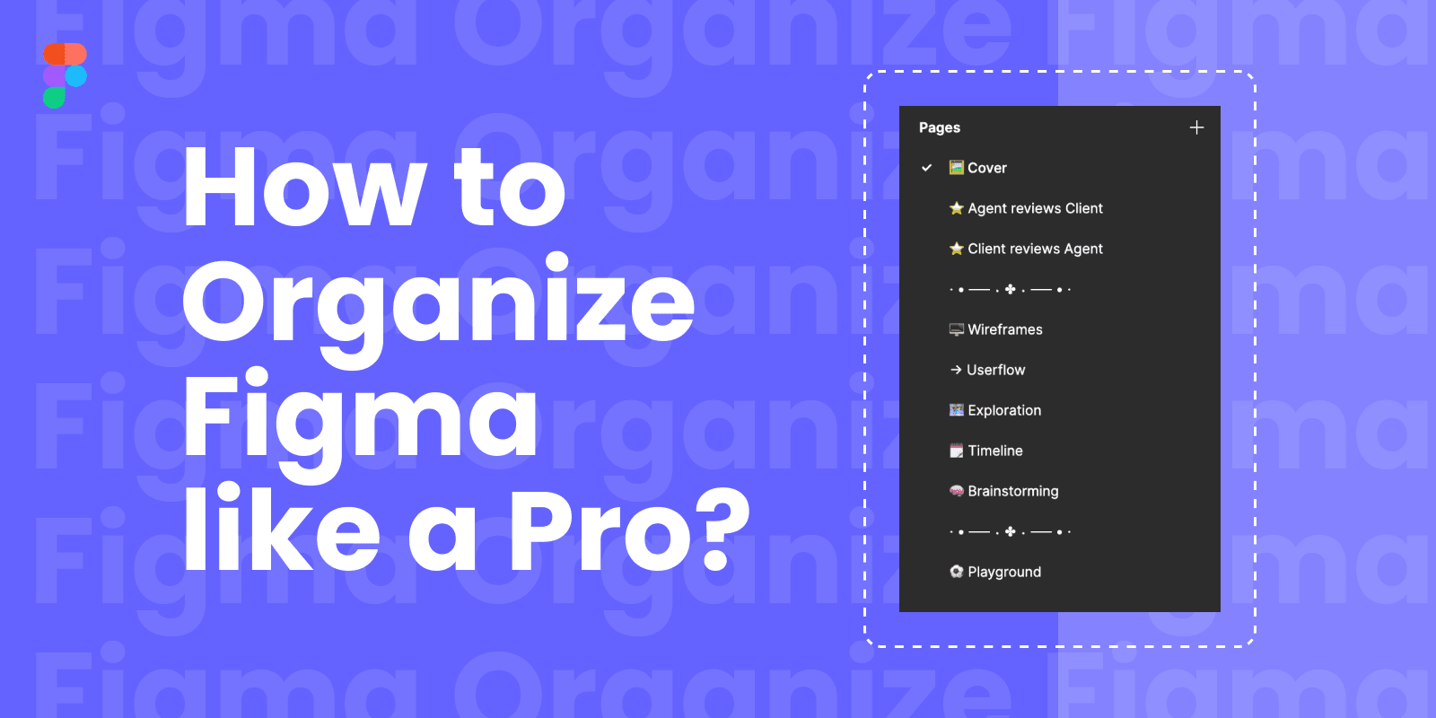
Organize Page structure
When working on design projects in Figma, it's important to structure your pages so that you can keep your work organized and easily navigate through your files. To structure pages in Figma, you should first group your designs into different categories and create a separate page for each category. Give each page a name that clearly describes the category it represents. By taking the time to structure your pages in Figma, you'll be able to focus on your work and make it easier for others to understand your design and give feedback.
Create a page and name it then add an emoji in front of it to provide a fun visual cue. Emojis can give your Figma file a bit of personality. They’re not necessary, but they make the whole designing experience delightful and more “Happy.” Add other pages/section headings according to the need and preference of the project. If you want to uplevel your page structure, you can even include spacer/divider pages in your left-side panel so that there’s a clearer distinction between pages. These are created using a series of hyphens in the name of the page–simple, but effective!

Group and name Layers
Organizing your layers in Figma is essential to ensure easy navigation and efficiency when working on design projects. One effective method to achieve this is by giving your layers descriptive names that make sense to you and other collaborators. You can also group similar layers and assign them a parent name to keep things neat. Additionally, the search feature in Figma can be used to quickly locate specific layers by name. This ultimately saves time and improves your workflow.

Playground Page
A playground page in Figma is like a sandbox where you can play around with design ideas without messing up your main design files. It's a blank space where you can test out different design elements, styles, and techniques. Playground pages are great for exploring new design concepts or trying out different approaches to a project, without worrying about messing up your original work.
Create a page and name it "Playground" or any page you prefer. Start experimenting with design elements, styles, and techniques on the Playground page. You can use it as a blank canvas to try out different ideas without affecting your main design files. Once you've developed a concept that you're happy with, transfer it over to your main design file for further refinement.

Publish and import styles or components
Styles are a set of properties applied to an object, such as a color, font size, or spacing, that can be saved and reused across the design file. Using styles ensures consistency across the design and makes it easy to update multiple objects at once. Components are reusable design elements, such as buttons, icons, or navigation bars, that can be saved and used throughout a design file or across multiple files. Components can also have their styles and properties, making it easy to maintain consistency and update designs quickly. Together, styles and components help designers maintain a consistent visual language and streamline the design process, making it faster and more efficient.
Once you have created a design system in Figma, you can publish and import styles and components from it.
Publish
To publish styles or components, select the item(s) you want to publish and click on the "Publish" button in the right-hand panel. This will bring up the "Publish Styles" or "Publish Components" dialog box, where you can give the style or component a name and description.
You can also choose whether to publish it to a specific team or project or make it public and accessible to anyone.

Import
To import styles or components from your design system, open the file where you want to use them and click on the "Team Library" icon and click the toggle on for the library you want to import. Then, from the "Assets" panel on the left-hand side, you can search for and select the styles or components you want to use, and then drag and drop them onto your design. Alternatively, you can right-click on the style or component and choose "Apply" to add it to your design.
By publishing and importing styles and components from your design system, you can ensure consistency across all of your designs and make it easier to work collaboratively with other designers on your team.

Hopefully, this will inspire you to create a well-structured Figma file template. Remember to make it easy for collaborators and viewers of the file to navigate and quickly find what they need. 🙂