How to set border lines on a CSS Grid layout
👋 Hello World! I'm Binay Maharjan, a passionate Front-End Developer the ever-evolving realm of web development. 🚀 🌈 Design Enthusiast: With an eye for aesthetics, I bring designs to life, ensuring a seamless fusion of form and function. My CSS skills extend to animations, transitions, and the art of making websites not just functional, but delightful. 📐 Responsive Design Advocate: From desktops to tablets and smartphones, I'm dedicated to creating websites that adapt flawlessly to every screen size. A user-centric approach guides my responsive design philosophy. ⚙️ Tech Innovator: I thrive on staying up-to-date with the latest trends and emerging technologies in the front-end development landscape. Constantly refining my skills to implement cutting-edge solutions, I am committed to delivering high-quality, forward-thinking code.
Grid Layout allows for the creation of grid structures using CSS instead of HTML. It helps us to create layouts that can be redefined using Media Queries and adapt to different contexts.
Grid Layout lets us properly separate the order of elements in the source from their visual presentation. As a designer, you have the freedom to move page elements to the best location for your layout at different breakpoints and do not need to compromise a sensibly structured document for your responsive design.
It’s very easy to make the grid adapt to the available space. With each element having an area on the grid, things are not at risk of overlapping due to text size changes, more content than expected, or small viewports. Unlike with an HTML table-based layout, you can layer items on the grid. So, one item can overlap another if required.
There are numerous manual, non-scalable methods for getting this effect. Every time I've seen it done, the method has been incredibly disorganized, inflexible, and challenging to control.
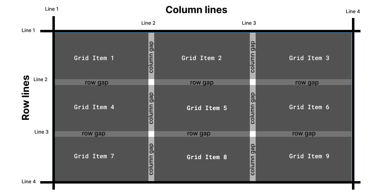
And we’re going to do this right, a few things need to be accounted for:
We need to be able to change the number of grid columns without affecting the borders.
A grid with a missing grid item should not break the borders.
The borders should degrade gracefully from breakpoint to breakpoint – we must avoid changing our instructions at various breakpoints if possible.
We want to avoid crazy
:nth()selector tactics. If we’re forced to try and programmatically select items in the grid based on counting, we will lose our flexibility to change column counts.
Step 1: HTML Structure for grid
<div class="grid">
    <div class="grid-item">
        Gird item 1
    </div>
    <div class="grid-item">
        Gird item 2
    </div>
    <div class="grid-item">
        Gird item 3
    </div>
    <div class="grid-item">
        Gird item 4
    </div>
    <div class="grid-item">
        Gird item 5
    </div>
    <div class="grid-item">
        Gird item 6
    </div>
</div>
Step 2: Add CSS for grid layout
.grid {
   display: grid;
   grid-template-columns: repeat(3, minmax(0, 1fr)); // column count
    overflow: hidden; //this will hide -1px the top and left line
}
Step 3: Add relative CSS property in the grid item
We’re going to use pseudo-elements for everything. Why? Because borders will have too many limitations. Since we need to position the pseudo-elements absolutely, we need to set the parents to position relative. We can do this on all grid items. By adding CSS position relative in the grid item class, our parent element is ready to have a pseudo-element as a child while positioning absolute
.grid-item{
    position:relative
}
Step 4: Common CSS for Pseudo Elements
We’re going to use both ::before and ::after elements for this technique. Both will share some styling, so in the interest of efficiency and not repeating ourselves, we will establish common css styles first:
.grid-item::before,
.grid-item::after {
   content: '';
   position: absolute;
   background-color: #333;
   z-index: 1;
}
This effectively creates a ::before and ::after pseudo-element attached to every single grid item that is absolutely positioned.
We'll use
::afterpseudo-element for row line and::beforepseudo-element for column line
Step 5: Adding border in a row line
.grid-item::after {
  width: 100vw;
  height: 1px;
  left: 0;
  top: -1px;
}
Width of 100% would make the bottom line only the width of each grid item and would fail to account for the gap. It also causes issues when there are uneven items in the grid. What we need is a width that is guaranteed to span the entire width of the grid container. 100vw will span the entire width of the grid parent in all situations since it is designed to span the entire width of the viewport.
Height 1px is to set the height of the line like the border width, top -1px will push the line to the top
Step 5: Adding border in a column line
.grid-item::before {
  width: 1px;
  height: 100vh;
  left: -1px;
  top: 0;
}
Same as width 100vw in row line we use height 100vh because we want a column line from top to bottom of the grid item on the left side. And we used the left -1px to move the line in every grid item top as 0 to start it always from the top of the grid.
Here, is a working example for set border line in grid layout
Working example using tailwind grid layout
Conclusion
Grid containers consist of grid items, placed inside columns and rows. We can use a CSS grid layout as a table including internal borders with the help of simple CSS ticks using pseudo-elements. Thank you.
References
https://robleto.medium.com/how-to-set-internal-border-lines-on-a-css-grid-layout-f2f1eeaafb61
https://www.w3schools.com/css/css_grid.asp