Material Design 3 for Mobile Application Development
Material Design is an adaptable system of guidelines, components, and tools that support the best practices of user interface design. Backed by open-source code, Material Design streamlines collaboration between designers and developers, and helps teams quickly build beautiful products.
- https://m3.material.io/
Introduction
Material Design was first introduced in 2014 with the following principles:
Material is the metaphor
Bold, graphic, intentional
Motion provides meaning

To talk a little about history, the archived edition of Material Design 1 can be located at this link. Before the introduction of Material Design, there were no explicit instructions regarding the design of Android applications. It also suggests do's and don'ts for UI practices.
Subsequently, Material Design 2 was unveiled, featuring improved design principles and a range of UI elements.


Generally, Material Design components are first adapted to newer Android OS versions and Google apps. M2 was the successor to the M1 with a refined design system. But the latest version of the material design, Material You or M3 is the major overhaul and is visually more appealing than the previous M2. Also, it has a wide range of resources available.

Here are some quick links to the resources related to Material 3 design,
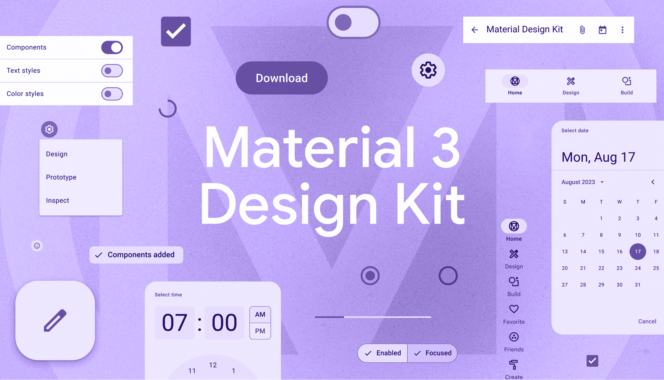
Material Design Components
Action Components
These action components include user interaction-related components like clicking and making a new action. The action components contain button, floating action button, icon button, and segmented button.

Communication Components
Communication components include the message and indicator components to notify the counts, status, progress, and message. These components include badges, linear progress indicator, circular progress indicator, and snackbar.

Containment Components
These containment components are used to show the information along with user-related actions.


Navigation Components
These navigation components help the user to switch between screens and navigate from one to another. A wide variety of navigation options are provided with the bottom app bar, navigation bar, navigation drawer, navigation rail, and tabs.


Selection Components
These selection components help the user to choose from the provided options. Generally, checkbox, chips, date pickers, menu, radio button, sliders, switch, and time picker falls under selection components.


Text Input Components
These text input components enable the user to write and edit the text content

Pros
Design principles to make consistent UI
Well-researched by the Google Team
Ready to use components with simple API
Interaction animations already implemented inside the components
Customizable to match our own design
Easy to configure and switch the theme
A collection of freely available fonts and icons
Guide to use animations and transitions
Cons
The design may feel obsolete if not updated to newer iterations over a period
The native application feel may not come on iOS devices
Since most Google apps adapt Material Design, some users might associate your app with Google apps
Too many color choices
Conclusion
The article might feel incomplete without this section, so here it is. 😊 Material design can be used to make a quick prototype of the applications as well as full-fledged scalable production apps. The designers can take these design guidelines to incorporate newer UI concepts to improvise the application's UI/UX to suit the app's requirements.
Every design is not perfect and this material design will have another iteration. M4 might come after a few years and M3 will serve its purpose till then.