Psychology of Gestalt's Principles
Gestalt principles are a set of psychological principles that explain how humans perceive and interpret what they view from their eyes. These principles are widely applied in various design fields, including UI/UX design, to enhance the user experience and create visually cohesive and effective interfaces.
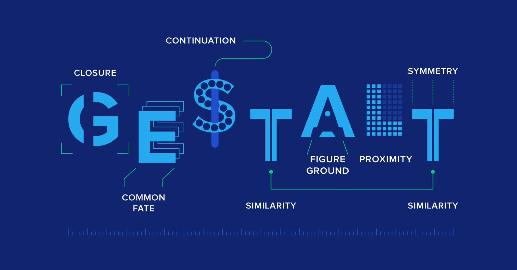
Proximity
Objects that are close to each other are perceived as belonging together. In design, placing related elements nearby helps users understand the relationships between them. Thinking about the distance between items is a great way to indicate how they’re related. So, if things are tightly nested together with even spacing, they will feel as if they are the same.
Eg: The menu items on the menu bar of websites are close to each other. This differentiates them from other elements available on the bar and can be perceived as together.
Similarity
Elements that share similar visual characteristics, such as color, shape, or size, are perceived as belonging to the same group. Applying similarity helps users quickly identify related elements. This principle is used in sections with similar elements to make it feel like a group. It can be seen using consistent color, style, size, shape and more.

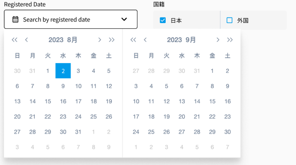
Focal Point
This principle states that our attention will be drawn toward contrast elements, i.e. the element that is unlike others in some way. In the image below, your eye should be drawn to the currently selected date. It is in a different shape and color from the other elements.
Closure
When elements are presented with incomplete information, people tend to mentally fill in the gaps to perceive a complete object. As designers, we can achieve closure by creating suggestive visual elements, such as connecting lines or shapes, to imply relationships between components.
Eg: The loader as shown is in grey and 1/4 part of the loader seems to be incomplete. But as a user, we fill the incomplete gap and visualize it as a full circle.
Continuity
It states "Elements arranged on a line or curve are perceived as more related than elements not on the line or curve. "The human eye tends to follow a continuous path rather than sudden changes". In the field of design, designers use continuity to guide users through a logical flow. This can be achieved through consistent layouts, aligning elements, and creating smooth transitions.
Eg: The logo of Amazon follows the continuity principle. It has a curve arrow starting from a to z(a-> z) which also means that we can find every product from A to Z on one platform.

Symmetry
Elements arranged symmetrically or in a well-organized manner are perceived as more stable and visually appealing. Symmetry and order are often applied in UI layouts to create a sense of balance and structure.
Eg: As you can see, the elements in the image inside the green boundary have a nice flow of text and images centrally aligned, with everything nicely spaced. This feels nice to look at and has ordered so that you can easily follow the content.
Common Region
It states that "Elements are perceived as part of a group if they are located within the same closed region". An alternative method for indicating a connection between elements is to enclose them within a boundary. All contents within the enclosure are perceived as interconnected, while anything outside the boundary is viewed as distinct.
Eg: The image shows that the contents related to each other are grouped under the same common regions and distinct from another group with the boundary.

Common Fate
It states that "Elements that move in the same direction are perceived as more related than elements that are stationary or that move in different directions." Those objects moving in the same direction or sharing a common motion are taken as part of a group and interrelated with each other.
Eg: The below-shown carousel follows this principle as all the screens keep on moving in the same direction.
Parallelism
It states "Elements that are parallel to each other are seen as more related than elements not parallel to each other". This principle contributes to creating a sense of order, structure, and organization in visual perception. Parallelism can be used to guide the user's eye, create alignment, and convey a sense of unity.
Eg: Every row shown in the below figure are parallel to each other.
Law of Prägnanz
People tend to interpret ambiguous or complex images in the simplest way possible. This is the fundamental principle of gestalt. This encourages designers to create clear and straightforward interfaces, avoiding unnecessary complexity or ambiguity. They take less time for us to process and present less dangerous surprises.
Eg: As per the below-given design, the elements on the left section are difficult to understand individually. But visualizing it as a whole is clear, easy to understand and gives meaning to it.

Conclusion
In conclusion, by implementing these Gestalt principles, designers can create interfaces that are visually pleasing, and easy to understand. Along with this, it also plays a vital role in building up the user experience.