TailwindCSS Awesomeness 😎: My Personal Features Spotlight

As a front-end developer, I'm always on the lookout for tools and frameworks that can make my life easier and my code more efficient. One such tool that has truly revolutionized my workflow is Tailwind CSS.
TailwindCSS is a utility-first CSS framework that has gained immense popularity in recent years for its simplicity and flexibility. In this blog, I'll be sharing my favorite TailwindCSS features that have made it an essential part of my front-end development toolkit.
1. Dark Mode 🌒
Dark mode has become a must-have feature for modern web applications, and TailwindCSS makes it incredibly easy to implement. You can toggle between light and dark modes with just a single class.
To make this as easy as possible, Tailwind includes a dark variant that lets you style your site differently when dark mode is enabled:
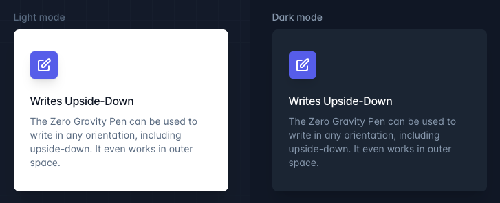
<div class="bg-white dark:bg-slate-800 rounded-lg px-6 py-8 ring-1 ring-slate-900/5 shadow-xl">
  <div>
    <span class="inline-flex items-center justify-center p-2 bg-indigo-500 rounded-md shadow-lg">
      <svg class="h-6 w-6 text-white" xmlns="http://www.w3.org/2000/svg" fill="none" viewBox="0 0 24 24" stroke="currentColor" aria-hidden="true"><!-- ... --></svg>
    </span>
  </div>
  <h3 class="text-slate-900 dark:text-white mt-5 text-base font-medium tracking-tight">Writes Upside-Down</h3>
  <p class="text-slate-500 dark:text-slate-400 mt-2 text-sm">
    The Zero Gravity Pen can be used to write in any orientation, including upside-down. It even works in outer space.
  </p>
</div>
Advantages:
Enhances user experience by providing a choice of interface color schemes.
Reduces the need for complex CSS or JavaScript to switch themes.
2. Line-clamp out of the box 🔍
Truncating long blocks of text is a common requirement in web design, and TailwindCSS simplifies this with the line-clamp class.

<article>
  <div>
    ...
    <p class="line-clamp-3 mt-4 text-sm/6 text-gray-600">
      Nulla dolor velit adipisicing duis excepteur esse in duis nostrud occaecat mollit incididunt deserunt sunt. Ut ut sunt laborum ex occaecat eu tempor labore enim adipisicing minim ad. Est in quis eu dolore occaecat excepteur fugiat dolore nisi aliqua fugiat enim ut cillum. Labore enim duis nostrud eu. Est ut eiusmod consequat irure quis deserunt ex. Enim laboris dolor magna pariatur. Dolor et ad sint voluptate sunt elit mollit officia ad enim sit consectetur enim.
    </p>
  </div>
  ...
</article>
Advantages:
No need to write custom CSS for text truncation.
Easily control the number of lines to display.
3. Group-hover and focus-within by default 🖱️
TailwindCSS applies group-hover and focus-within which is enabled by default and helps to style the elements within a parent container without the need for additional CSS classes.

<div class="group block max-w-xs mx-auto rounded-lg p-6 bg-white ring-1 ring-slate-900/5 shadow-lg space-y-3 hover:bg-sky-500 hover:ring-sky-500">
  <div class="flex items-center space-x-3">
    <svg class="h-6 w-6 stroke-sky-500 group-hover:stroke-white" fill="none" viewBox="0 0 24 24"><!-- ... --></svg>
    <h3 class="text-slate-900 group-hover:text-white text-sm font-semibold">New project</h3>
  </div>
  <p class="text-slate-500 group-hover:text-white text-sm">Create a new project from a variety of starting templates.</p>
</div>
Advantages:
Simplifies styling of interactive elements.
Keeps HTML clean and semantic.
4. Extended arbitrary value support 📏
TailwindCSS allows you to use arbitrary values in your utility classes, making it flexible and adaptable to your design needs. It is possible to add arbitrary CSS that you can combine with modifiers like hover, lg, and whatever else:
<div class="p-[10px] m-[2.5rem] text-[18px] bg-[#bada55] before:content-['Festivus']">
<!-- ... -->
</div>
Advantages:
Fine-grained control over design details.
Reduces the need for custom CSS.
5. Before and after pseudo-element variants 🧙♂️
Easily add ::before and ::after pseudo-elements to elements using TailwindCSS.
<div class="before:absolute before:content-[''] before:w-20 before:h-20 before:bg-blue-500">
<!-- ... -->
</div>
Advantages:
Quickly create decorative elements without writing extra CSS.
Keep HTML clean and maintainable.
6. Gap and Space Between 🕳️
I use space between features when the UI is in a list item format. This utility class space-x-{amount} aids in managing the spacing between child elements. It goes for horizontal and vertical space between children.
<div class="flex space-x-4 ...">
  <div>01</div>
  <div>02</div>
  <div>03</div>
</div>
I utilize the gap utility class to regulate the spacing between grid and flexbox items, facilitating the management of gaps between elements within flex and grid layouts.
<div class="flex gap-4">
  <div>Item 1</div>
  <div>Item 2</div>
</div>
Advantages:
Easily create responsive layouts with consistent spacing.
No need to write custom CSS for spacing.
7. New line-height shorthand for font-size utilities 📝
Managing line heights is simplified with TailwindCSS's line-height shorthand text-lg/{{amount}}
<p class="text-sm font-medium text-lg/7 ...">
    <!-- ... -->
</p>

<p class="text-sm/[17px] ..."></p>
Advantages:
Improved readability and aesthetics of text.
Saves time when setting line heights.
8. Isolation 🧪
This feature helps for controlling whether an element should explicitly create a new stacking context. It prevents styles from leaking into or out of a component by using the isolation class.
<div class="isolate">
   <!-- ... -->
</div>
Advantages:
Isolate styles to prevent unintended side effects.
Better encapsulation of components.
9. Divide Width, Color, and Style 📏🎨🖌️
TailwindCSS makes it easy to add dividers between elements with custom width, color, and style. These utility classes divide-{{direction}},divide-{{color}}, divide-{{style}} helps in controlling the width, color and style of the border between the elements.
<div class="divide-x-2 divide-red-500 divide-dotted">
  <span>Item 1</span>
  <span>Item 2</span>
</div>
Advantages:
Customize dividers to match your design.
Reduce the need for additional CSS for dividers.
10. Accent Color 🎨
Easily create an accent color for your application and use it consistently. This utility class accent-{{color}} for controlling the accented color of a form control. This helps style elements like checkboxes and radio groups by overriding the browser’s default color.

<label>
  <input type="checkbox" checked> Browser default
</label>
<label>
  <input type="checkbox" class="accent-pink-500" checked> Customized
</label>
Advantages:
Control the checkbox and radio color without using any extra CSS.
Time-saving and consistent on the form elements
11. CSS variables without the var() 🔄
TailwindCSS allows you to define and use CSS variables without the var() syntax.
<div className="bg-[--brand-color] hover:bg-[--brand-hover-color]">
<!-- ... -->
</div>
Advantages:
Simplifies the use of CSS variables.
More readable and concise code.
12. Scroll Snap Align 🧭
Create scrollable sections with precise alignment using TailwindCSS. This utility class snap-{{alignment}} helps for controlling the scroll snap alignment of an element.
<div class="scroll-x">
  <div class="snap-start">Section 1</div>
  <div class="snap-center">Section 2</div>
  <div class="snap-end">Section 3</div>
</div>
Advantages:
Improve user experience in scrollable sections.
Create interactive and engaging web interfaces.
13. Simplified RTL support with logical properties 🌐
TailwindCSS supports Right-to-Left (RTL) languages effortlessly using logical properties. This uses logical properties which helps in styling more easily and automatically.
Using new utilities like ms-3 and me-3, you can style the start and end of an element so that your styles automatically adapt in RTL, instead of writing code like ltr:ml-3 rtl:mr-3
You can explore the newly added logical property utilities for inset, margin, padding, border-radius, scroll-margin, and scroll-padding.

<div class="group flex items-center">
  <img class="shrink-0 h-12 w-12 rounded-full" src="..." alt="" />
  <div class="ms-3">
    <p class="text-sm font-medium text-slate-300 group-hover:text-white">...</p>
    <p class="text-sm font-medium text-slate-500 group-hover:text-slate-300">...</p>
  </div>
</div>
Advantages:
Better internationalization and accessibility support.
Simplifies development for RTL languages.
14. Overscroll Behavior 🔄
This utility class overscroll-{{control}} helps for controlling how the browser behaves when reaching the boundary of a scrolling area. This usually prevents parents from over scrolling. This has three usages
Preventing parent overscrolling (using
overscroll-contain)Preventing overscroll bouncing (using
overscroll-none)Using the default overscroll behavior (using
overscroll-auto)
<div class="overscroll-auto">
  <!-- ... -->
</div>
Advantages:
Improve the user experience by controlling scroll behavior.
No need for custom JavaScript to over-scroll.
15. Text overflow utility 📏
Use truncate to truncate overflowing text with an ellipsis (…) if needed.

<p class="truncate">
  <!-- Content -->
</p>
Use text-ellipsis to truncate overflowing text with an ellipsis (…) if needed.
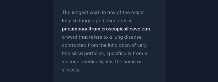
<p class="text-ellipsis overflow-hidden"><!-- Content --></p>
Use text-clip to truncate the text at the limit of the content area.
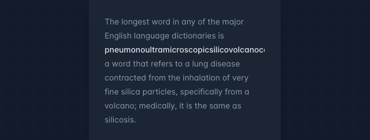
<p class="text-clip overflow-hidden"><!-- Content --></p>
Advantages:
Saves Space
Text Overflow Handling
Improved Readability
Conclusion
👏👏 TailwindCSS is a game-changer for front-end developers, offering an extensive set of features that simplify the development process, enhance maintainability, and improve the user experience. These 15 features are just a glimpse of what TailwindCSS has to offer, and I can't wait to see how it continues to evolve and shape the future of web development.
The features mentioned above are really handy for improving the readability and efficiency of my code. While there are many other Tailwind utility classes we use daily, these are my personal favorites.
Note: For additional information, you can visit the official TailwindCSS website. All the screenshots provided are sourced from the TailwindCSS website.
Feel free to share your thoughts and opinions and leave me a comment if you have any problems or questions. 😎😎
Till then, Keep on Hacking, Cheers
About the author
Exploring the new tools and techniques on frontend development. Loves to meet up with new people and participate in the community. I do interesting stuff on codepen https://codepen.io/nirazanbasnet
Comments
Join the discussionNo comments yet. Be the first to comment.


