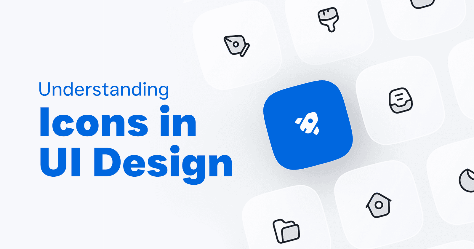
Understanding Icons in UI Design: Enhancing User Experience with Visual Elements
Experienced Creative Graphic/Multimedia Designer with 8+ years of experience, proficient in logo design, branding, digital and print designs, digital marketing, campaign designs, motion graphics, and media pre/post-production. Worked with diverse clients including NGOs, businesses, and digital marketing firms.
Icons might seem like tiny details in the grand scheme of user interface (UI) design, but they’re actually pretty powerful. As someone who spends a lot of time crafting these little visuals, I’ve seen just how much they can improve the way people interact with digital products. Let’s chat about why icons are so important and how we can use them to make our designs better.
Why Icons Matter in UI Design
Rapid Communication: Icons are like the emojis of the design world—they get the message across fast. Think about the trash can icon for deleting things or the magnifying glass for searching. These symbols are universally understood, saving users from having to read a bunch of text.

Improves Aesthetic: Icons not only serve a functional purpose but they are also intended to beautify your UI. They add to the visual appeal as a whole and can form part of a brand style guide.
Icons Save Space: Icons are space-savers. Instead of having long text labels, you can use compact icons. This is especially handy in mobile designs where screen space is at a premium.
Provide Easy Navigation: Consider icons as directions or guides for an interface. They direct users to the right place, leading to a seamless user experience. An example of that is a home icon, which usually brings you to the main page, or a gear for settings. Simple, right?

Anatomy of an Icon
Understanding the anatomy of an icon is crucial for designing iconography and evaluating the suitability of an existing icon set. Icons come in various shapes and sizes, so it's important to keep them within a standard-size container. This consistency makes it easier for developers and designers to work with icons and ensures they appear uniform in size.
Grids are a foundational tool in icon design. They might seem rigid or confusing at first, but they provide clear rules that help maintain consistency across all icons. Think of grids as a starting canvas; they help align the graphic elements, making it easier to ensure all icons work cohesively together and reduce the chance of mistakes.
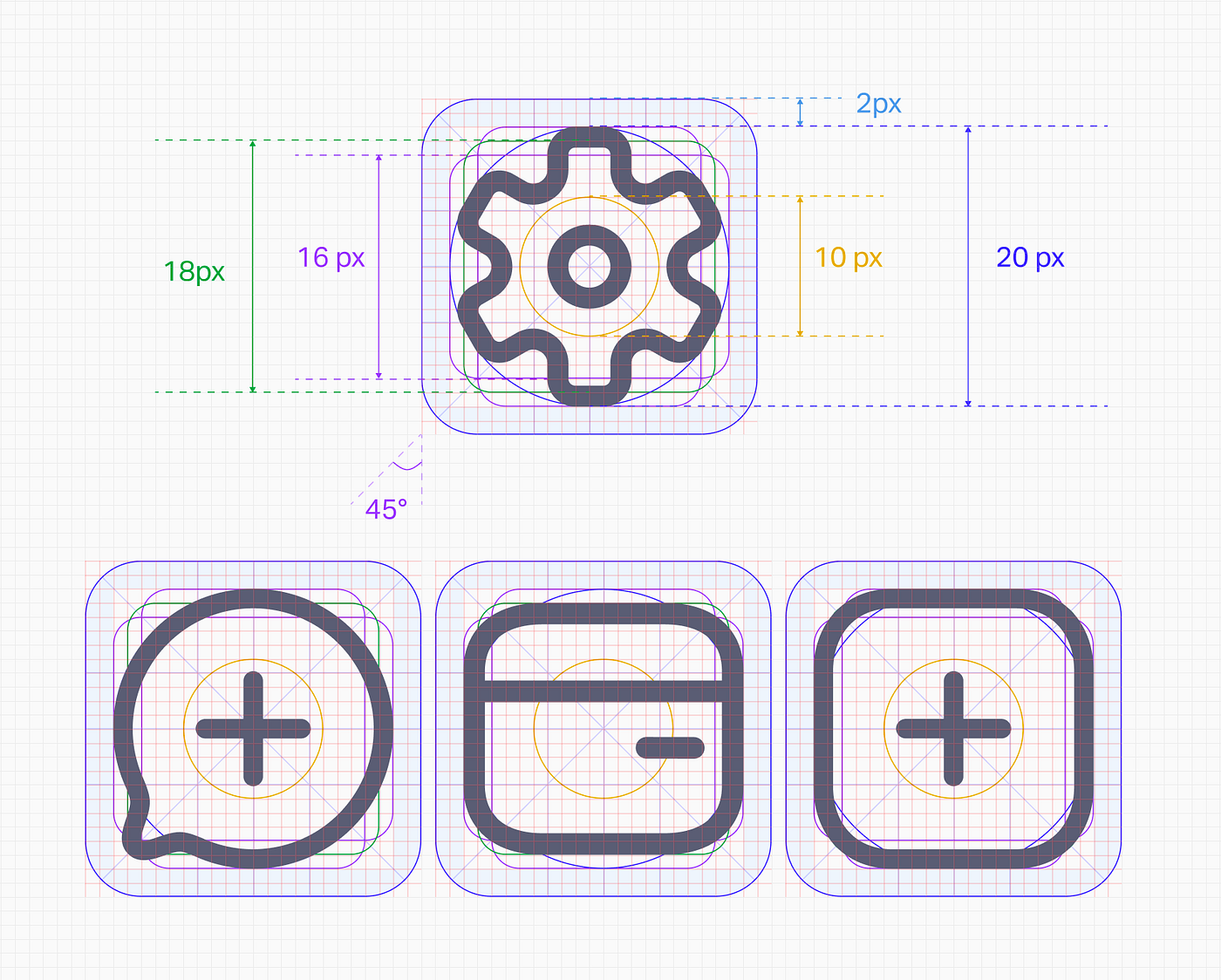
Within this grid and container setup, padding becomes a crucial element. Padding is the space between the icon and the border of its container. It needs to be adjusted for each icon to ensure visual consistency, making sure the icons are evenly spaced and balanced.
Keylines are another essential aspect of icon design. They serve as guides for maintaining consistent visual proportions, typically starting with basic shapes like squares, rectangles, and circles. Keylines help in creating icons that are visually cohesive without limiting creativity.
Lastly, the border radius, or how rounded or sharp the corners of an icon are, plays a significant role in the visual consistency of your icon set. If one icon has sharp corners, it’s important to maintain this style across all icons to ensure a unified appearance.
Tips for Using Icons Effectively
Use Context: Place icons where they make sense. A shopping cart icon should be near shopping functions, for example. This makes it easier for users to understand what will happen when they click an icon.

Stay Consistent: All your icons should have a similar style, size and color. By keeping these elements consistent throughout your app, you enable users to identify what each one is quickly and see how the design looks put together.
Be Clear: Everyone should understand what the icon means. Be specific. Do not create overly complicated designs that will confuse the user. Sometimes, the simplest design is the most effective.
Think Scalability: Design your icons so they look good at any size. Whether small buttons or large banners, they should remain clear and sharp. Vector graphics are great for this because they scale without losing quality.

Provide Feedback: When users interact with an icon, give them some visual feedback. Maybe the icon changes color or animates slightly. This reassures users that their actions have been recognized.
Think About Accessibility: Not everyone sees things the same way. Use high-contrast colors and add text descriptions for screen readers to ensure everyone can use your icons.
Test with Real Users: Get feedback from actual users. They can tell you if an icon is confusing or if it works well. This feedback is invaluable for making improvements.
Conclusion
Icons are small but mighty components of UI design. They help users understand and navigate your product while also adding a touch of style. By focusing on consistency, clarity, context, accessibility, feedback, scalability, and user testing, you can create icons that significantly enhance the user experience. As I continue working on various UI projects, I’m constantly amazed at how these tiny visuals can make such a big difference.