Hello Folks, Myself Sandip Bhandari from NEPAL I’m a Product Designer with 2 years of experience designing engaging and user-friendly interfaces for web applications for both desktop and mobile .
Tailwind CSS is an open-source CSS framework that was created to make web development simpler and faster. It is a utility-first framework that provides a set of utility classes to help developers create custom designs without writing a single line of code.
<div class="flex items-center justify-center bg-gray-300 h-12 w-12 rounded-full">
<button class="text-white bg-blue-500 hover:bg-blue-600 rounded-full py-2 px-4">
    Click me
</button>
</div>
Tailwind CSS vs. Other CSS frameworks
When it comes to CSS frameworks, there are several options available like Bootstrap and Foundation, as it does not come with pre-built components, instead opting for a utility-based approach. This means that developers must write the CSS themselves, including all the various classes and attributes needed to create a responsive design.
However, Tailwind CSS stands out from the crowd due to its utility-first approach. Unlike other frameworks, Tailwind CSS does not provide pre-defined components that developers must use. Instead, Tailwind CSS provides a set of utility classes that can be used to quickly and easily create custom designs.
It enables Building complex responsive layouts freely and facilitates fluid community interaction.
Power of Tailwind CSS
It has to be our most exciting release yet, with features such as:
- Just-in-Time Mode: Version 2.1 of Tailwind CSS introduces a new Tailwind JIT compiler that builds templates as needed rather than doing it all at once during the initial construction phase.
Here is what your tailwind.config.js should look like:
module.exports = {
  mode: 'jit',
  purge: ['./public/*.html'],
  darkMode: false, // or 'media' or 'class'
  theme: {
    extend: {},
  },
  variants: {
    extend: {},
  },
  plugins: [],
}
and we can simple use it as:
<div class="mt-[300px] w-[500px]"></div>
Scroll snap API: The CSS property scroll-snap-type determines how rigorously snap points are applied to the scroll container. The new scroll-snap tools will make creating sliders and full-page slides super duper easy!
Below 👇 are the new utility classes that are now available to use in the parent container:
-- > snap-none
-- > snap-x
-- > snap-y
-- > snap-both
-- > snap-mandatory
-- > snap-proximityNext 👇 are the new utility classes for each child element:
-- > snap-start
-- > snap-end
-- > snap-center
-- > snap-align-none
<div class="snap-y snap-mandatory h-screen overflow-scroll">
    <div class="snap-start bg-amber-200 w-screen h-screen flex items-center justify-center text-8xl">1</div>
    <div class="snap-start bg-teal-200 w-screen  h-screen flex items-center justify-center text-8xl">2</div>
    <div class="snap-start bg-cyan-200 w-screen h-screen flex items-center justify-center text-8xl">3</div>
    <div class="snap-start bg-fuchsia-200 w-screen h-screen flex items-center justify-center text-8xl">4</div>
</div>
- Multi-column layout: Use the
columns-{count}utilities to set the number of columns that should be created for the content within an element &columns-{width}utilities to set the ideal column width for the content within an element. To specify the width between columns, you can use thegaputilities
<div class="columns-3 gap-8 ...">
  <img class="columns-3xs ..." src="..." />
  <img class="w-full aspect-square ..." src="..." />
  <!-- ... -->
</div>
- Aspect Ratio: It's a utility for controlling the aspect ratio of an element. Utilize square brackets to create a property on the fly using any arbitrary value if you need to use a one-time aspect ratio value that doesn't fit in your theme.
<div class="w-full aspect-square ..."></div>
- Portrait and Landscape Modifiers: Also, we have new modifiers that give us more control over the page, like:
<div class=”portrait:hidden”>
Hello from landscape!
</div>

<div class=”landscape:hidden”>
Please rotate your device!
</div>
- RTL and LTR modifiers: To your Tailwind project, Tailwind Direction adds a custom direction variant that enables you to create your own CSS rules for LTR and RTL layouts. Hence Use the
rtlandltrmodifiers conditionally add styles in right-to-left and left-to-right modes respectively when building multi-directional layouts:
<div class=”ltr:bg-red”>
…
</div>

<div class=”rtl:mr-8”>
…
</div>
- Play CDN: Since there is no practical method to create a CSS-based CDN build for Tailwind CSS v3.0, we had to take an alternative approach and create a JavaScript library. To use every functionality of Tailwind in the browser, simply add that script element to any HTML document. Even though it's simply intended for testing reasons, it's a lot of fun to create tiny prototypes or experiment with new concepts.
<!DOCTYPE html>
<html lang="en">
  <head>
    <meta charset="utf-8">
    <meta name="viewport" content="width=device-width, initial-scale=1.0" />
    <title>Example</title>
    <script src="https://cdn.tailwindcss.com/"></script>
  </head>
  <body>
    <!-- -->
  </body>
</html>
Tailwind CSS v3.2:
New features in Tailwind CSS v3.2 include support for dynamic breakpoints, multiple configuration files in a single project, nested groups, parameterized variations, container queries, and much more.
Other benefits of using Tailwind CSS
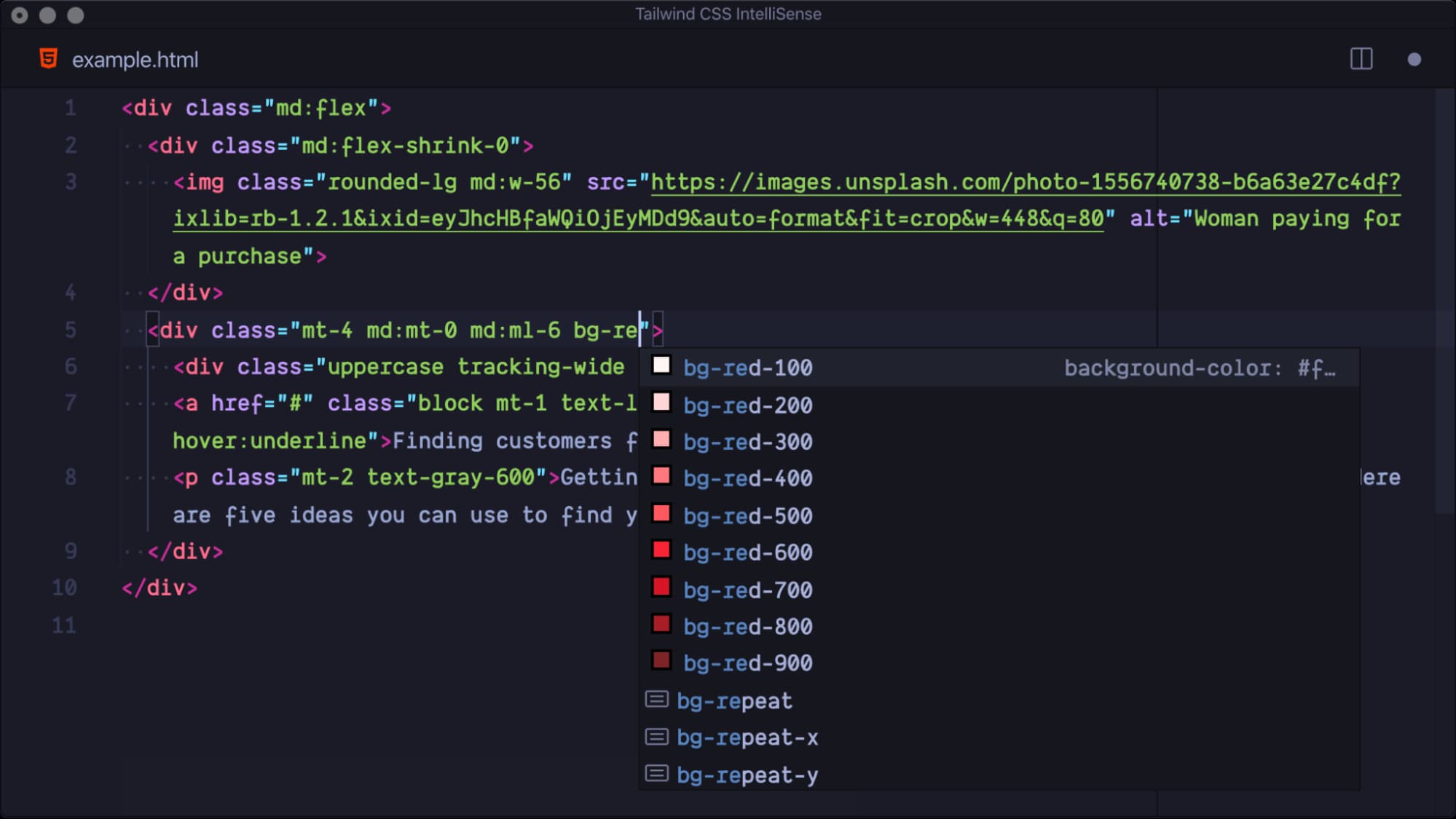
It has an incredibly awesome autocomplete support VSCode IntelliSense Extension to bring this front and center.

There are a few good UI Kits on the market that can help you get things done faster. Tailwind UI, Tailwind UI Kit and Tailwind Blocks are the some I've looked into.
We can simply create our own custom Tailwind CSS Plugin
const plugin = require('tailwindcss/plugin')

module.exports = {
// The rest of our Tailwind configuration
  plugins: [
    plugin(function(arguments) {
      // Add your custom styles here
    }),
  ]
}
Read this doc for more detail
Conclusion
Tailwind CSS is a powerful and popular CSS framework for creating websites and user interfaces. It is a utility-first CSS framework that allows developers to quickly and easily create custom designs without writing a single line of code. Tailwind CSS has become the go-to framework for developers looking to build modern, responsive websites with minimal effort.
If you’re looking for a powerful and easy-to-use CSS framework, Tailwind CSS is an excellent choice. So, if you’re looking to unlock the power of Tailwind CSS, this comprehensive guide should have provided you with the information you need to get started.